4 of the most overlooked web accessibility issues
What's up gamers. Lil' Boy back again bringing you another banger. This time on accessibility. Let's jump in.
jk. but for real, i'm gonna write about accessbility here so listen up, gamers.
Depending on who you follow online, accessibility in Websites is either something being shoved down your throat or something you've barely interacted with and scares you because there's a perceived high barrier-to-entry. For me, it's something that I feel should be easy to work with, if you use the tools at your disposal early on in development. It's just another routine you have to keep or a muscle you have to flex, and after some time it won't even be an afterthought. You'll find yourself having the foresight to easily prevent usability issues.
That being said, here's 4, low-effort methods you can implement to improve the accessibility of your site right now:
1. Use a color contrast checker
Typically, one of the first things people tend to do when working on their sites is obsess over layout and colors. Thinking about color should always be coupled with thinking about contrast as well - poor contrast can alienate people with decreased eyesight and ultimately make them leave your site. Color contrast checker tools like this one for example should be your best friend during the color selection process. You should make sure the background and foreground colors have at least a AA score (but really you should aim for AAA because why not really).
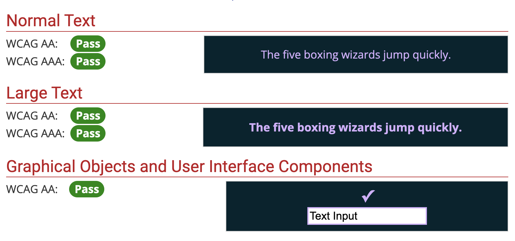 here's an example, comparing my blog's background and hyperlink colors
I'd recommend doing this for every piece of color on your site. Remember to test the obvious elements, but don't forget about pieces that are used less: disabled buttons or inputs, dimmed caption text, hover states on links. The contrast on all of these elements is important to think about because it's going to create inclusion for more people.
2. Use <form />, <input />, and <label /> elements correctly
If I could choose one thing that drives me nuts about Websites today, it's when I can't hit the "Enter" key to submit a form.
A runner-up though, is encountering inputs that aren't properly labelled and instead rely on using the placeholder property to explain what an input accepts. I fill out an entire form, go back to review my answers, and wow I can't quickly identify what some of the form fields are because the placeholder text is gone and there's no labels.
I don't know if JavaScript dominating the last 10 years of Web development caused these oversights, or whether people just stopped learning the basics of HTML, but if you develop any form on your website, there are 3 constants that should always exist:
- Your form needs to be wrapped in
<form />HTML element - Your form needs a
<button type="submit" /> - Every
<input />needs to be coupled with a<label />element
The first 2 points are functionality that will make your form respond to the expected keyboard events. I should be able to hit the "Enter" key to submit the form, regardless of what field I am focused on currently. Meanwhile, the third point about using <label /> elements should be implemented to help screen-readers explain what the field does to low-visibility users. But honestly it's just courteous towards able-bodied people as well.
So please use correct form markup. Or don't, I'm not your dad.
3. Add aria-labels to icon-buttons
You've seen this plenty of times: using a trash can icon to imply clicking will delete something, using an eyeball icon to reveal something that's hidden, or even using your site's logo to link back to your homepage.
These are really common-place patterns that Websites implement, mostly to add some personality or to simply save space. One thing that you might not think about is how this will appear to people who have low-visibility. Icons aren't descriptive - while they make sense to the large majority of us, to blind(er) people however, they're unclear because screen-reader technology isn't able to use human logic to assume what an icon implies (although maybe this will change with A.I. 🤷♀️).
This is where the aria-label property comes in handy, however you can also choose to hide the icon from screen-readers altogether, which leaves you 2 options:
- Add an
aria-labelproperty to your HTML element to explain what the element is meant to convey- e.g.
<button aria-label="delete the thing"><TrashCan /></button> - e.g.
<a aria-label="go to homepage" href="/home"><img src="./logo.png" /></a>
- e.g.
- Alternatively, you can add the
aria-hiddenproperty if your icon is not interactive and is purely meant for decoration- e.g.
<svg aria-hidden="true" />
- e.g.
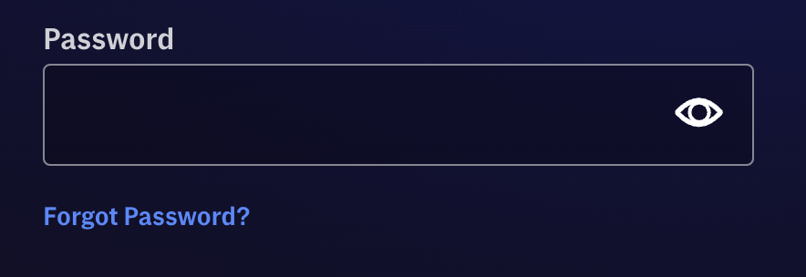
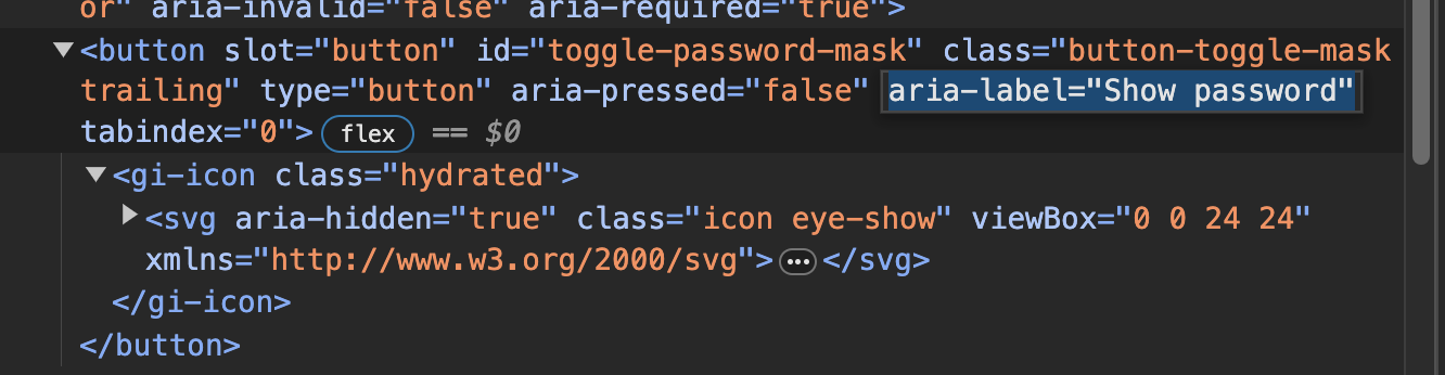 HBO Max's sign in screen shows an eyeball icon for showing your password, but includes an
 aria-label="Show password" to explain the button as text
4. Put both hands on your keyboard and use your website
The last method for checking the accessibility of your Website is abstract, but the most important one. At some point during the development of your Website, just for a few minutes, pretend you don't own a mouse and try navigating your entire site with just the keyboard.
Navigate through links, submit forms, open dropdown menus, close pop-ups, etc. You get the point. If at any point during this process you get stuck and can't interact with something, you need to go back to your code and fix it.
This is the ultimate test for your site and something that doesn't require any tooling or a hyper-educated background. It's a simple question: can you use your site without a mouse? If the answer is yes, bully for you, you're doing God's work. If not, go back to the drawing board and make sure you get this part of your site right before moving on to something else.
Alright gamers, that's it. Now get out there and sit in front of your computer all day and work on your Website. I believe in you.
like this post? discuss it on the forums at basementcommunity.com. Or you can also send me an email!